Lorem ipsum dolor amet, consect adipiscing elit, diam nonummy.


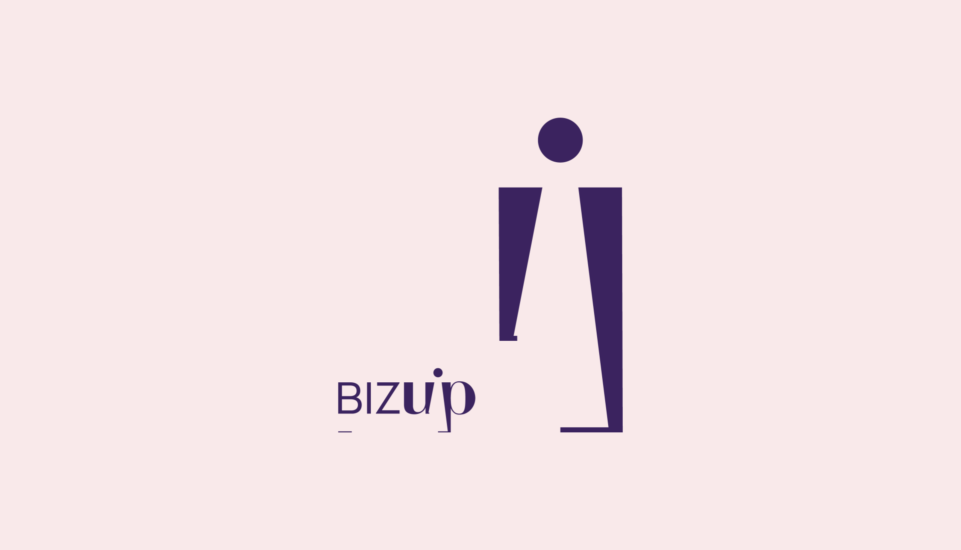

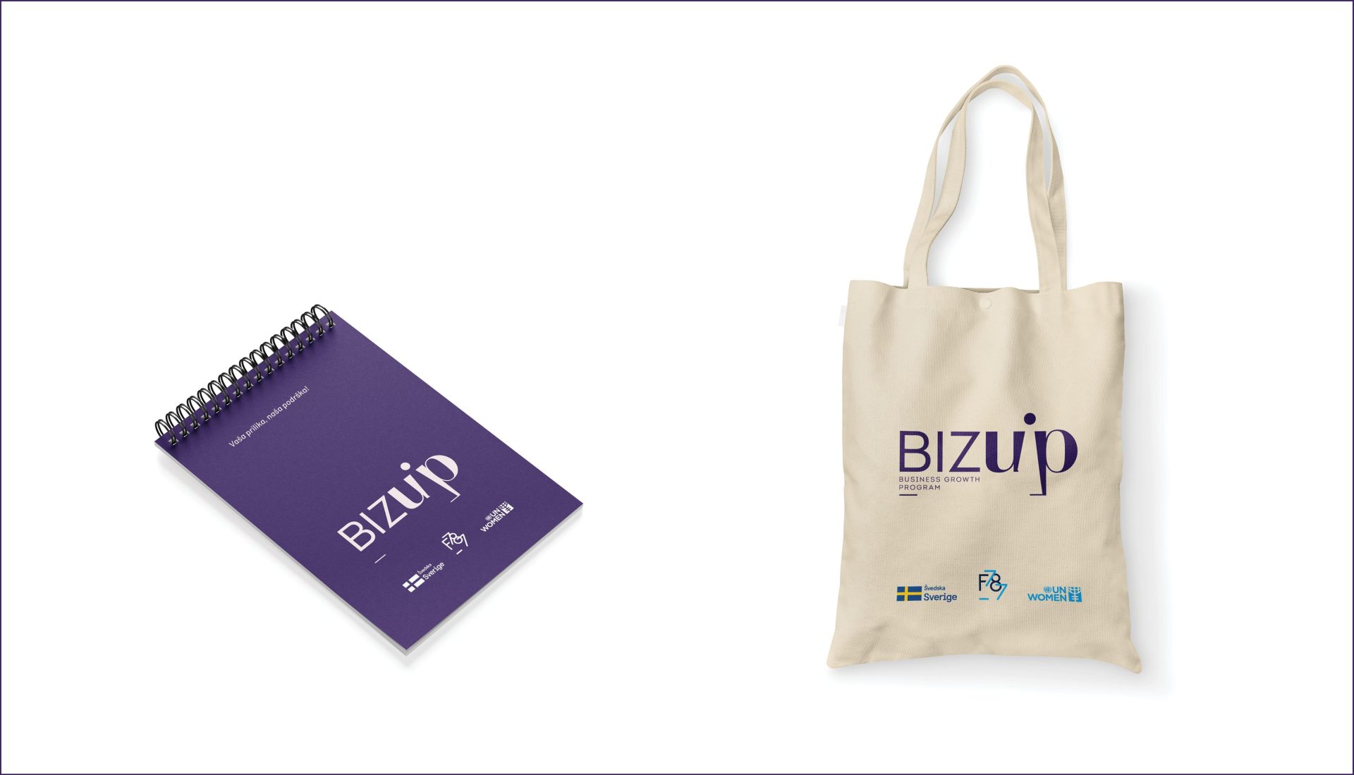
The BizUp program, dedicated to fostering the growth of female entrepreneurs, sought a visual identity that embodies support, growth, and unity. Tasked with creating a logo that resonates with the target audience, I designed a meaningful icon within the negative space between the letters Z and B. This clever use of space forms a female figure and an upward arrow, symbolizing growth and advancement. The sans-serif font adds a touch of seriousness and security, while the integrated icon subtly reinforces the message.
The resulting logo is not just visually appealing but strategically crafted to communicate the mission of supporting and empowering female entrepreneurs. Implemented in the BizUp program, the new visual identity got a robust response within the female entrepreneur community. Beyond aesthetics, the design is strategically aimed at attracting and encouraging female entrepreneurs to participate in the program, emphasizing the program’s core values of support, growth, and togetherness.